Okami
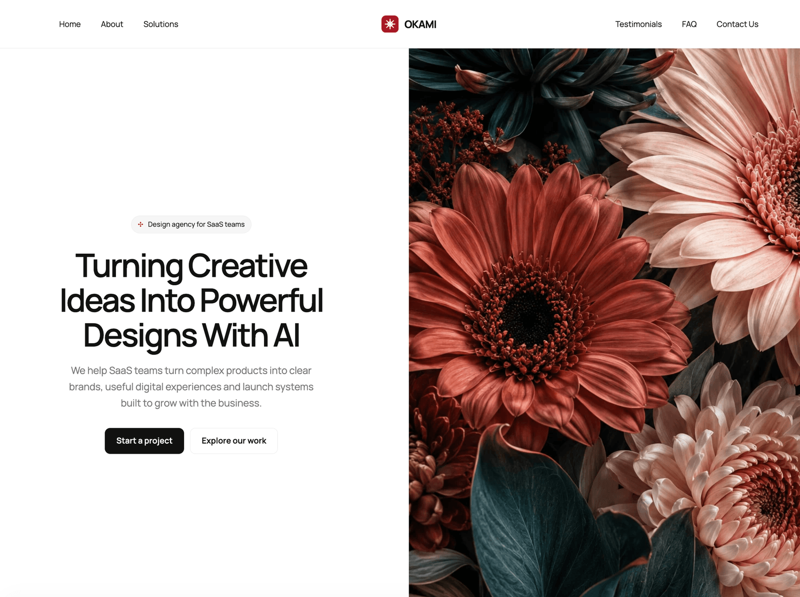
A clean, white theme for creative agencies, product studios and SaaS businesses. A split hero with full-height botanical art, three interactive product cards, dark case studies, solution pages and an optional journal.
Editions: Astro (source), HTML (plain files, no build).
One payment for Okami and everything else - all 35 themes, every future release, and the Astro visual builder included.
See Okami in action
Every page and section is part of the download. Use these as launch-day templates - keep the structure, swap the copy.
Okami is built for creative agencies, product studios and SaaS businesses. The demo is a design and product studio that works with SaaS teams on product design, AI product experience, brand and growth. The look is white and precise: Manrope throughout, fine vertical separator bands, a deep red accent with dark teal and coral, and a split hero that sets a centred headline beside full-height botanical artwork. The Why Choose Us section has three small working interfaces: a launch board with an Organize button, a brand card whose colour swatches change its accent, and a product dashboard with tabs you can switch with the arrow keys. Each card can show a photo instead by changing one setting. Case studies sit on a dark background, and the site includes four solution pages, two case studies, an about page, testimonials, an FAQ and an optional paginated journal. Agency buyers can use Solutions as services and Work as case studies. SaaS buyers can rename Solutions to product capabilities and use Work for customer stories. Every visible string, the palette, business details, FAQs, testimonials and form settings live in src/config/site.ts, and any solution, case study or article can be overridden there too. Locale-ready routes, three original images, and included AGENTS.md and CLAUDE.md files make it straightforward to adapt.
Best Fit For
- Creative agencies and design studios
- Product and UX studios working with software teams
- SaaS businesses that want an agency-grade marketing site
- Consultancies that publish case studies and a point of view
Full Page Set
Every page is real and editable - no placeholders, no "coming soon" stubs.
13 Sections Included
Every section is a ready-to-use Astro component. Add it to any page, customize via config, or remove what you don't need.
What's Included
Show the product, not only the promise
Three small working interfaces sit in the Why Choose Us section. Organize the launch board, change the brand card's accent with its swatches, or switch the dashboard's tabs with the mouse or the arrow keys. Prefer a photo? Each card takes an image with one setting.
One layout for an agency or a SaaS business
Agencies can present Solutions as services and Work as case studies. SaaS teams can rename Solutions to product capabilities and use Work for customer stories. The contact form works for project enquiries or demo requests.
Calm, precise, and a little red
White space, fine vertical separator bands, Manrope throughout, and a deep red accent with dark teal and coral. The dark case-study section and the red closing band give the page a clear rhythm.
Every visible edit in one place
Copy, palette, business details, testimonials, FAQs, and form settings live in site.ts, and any solution, case study, or article can be overridden there as well. The same content also stays editable as ordinary Markdown files.
Tech Stack
Config-Driven Setup
Okami keeps the copy, palette, business details, interactive card settings, testimonials, FAQs, legal placeholders, and form settings insrc/config/site.ts. Project and article prose stays in Markdown content collections.
// src/config/site.ts
export const siteConfig = {
  content:    { overrides: { services: {...}, projects: {...}, blog: {...} } },
  identity:   { name: "OKAMI", url: "https://example.com", ... },
  appearance: { ink: "#111111", red: "#a71926", teal: "#10363a", coral: "#d16e61", ... },
  hero:       { kicker: "Design agency for SaaS teams", headingLines: [...] },
  why:        { items: [{ title: "Clarity over complexity", visual: { type: "interactive" } }, ...] },
  reviews:    { items: [...] },
  faq:        { items: [...] },
  journal:    { enabled: true, pagination: { pageSize: 2, ... } },
  contact:    { form: { provider: "demo", formspreeId: "", ... } },
} as const;Built to be edited by AI
Okami ships an AGENTS.md and
a CLAUDE.md at the project root.
Claude Code, Cursor, Copilot, and Codex read them the moment you open the folder.
So your agent starts knowing which file to edit, which design decisions are deliberate, and which parts of the theme break quietly if touched. You get the right change on the first pass instead of a confident guess.
- A task map. Every common request routed to the exact file, so no time is spent exploring.
- Design invariants. The decisions that make the theme worth buying, marked do-not-touch.
- The traps. The specific things that break this theme silently, written down.
- A done checklist. What to build, what to scroll, what to verify before claiming success.
# OKAMI agent guide

- site.ts owns all public copy, identity, palette, motion,
  navigation, business and form settings, SEO, specimens,
  testimonials, FAQs, legal placeholders, and pagination.
- src/content/services/, projects/, and blog/ hold the
  Markdown defaults; content.overrides in site.ts mirrors
  every shipping entry by slug.
- Components must call getSiteConfig(Astro.url).
- Each why.items entry uses its interactive specimen or a
  local image through visual.type.
- Keep the contact form in honest demo mode until a provider is set.
- Agency buyers present services and case studies; SaaS buyers
  map them to capabilities and customer stories.

Run npm run check, npm test and npm run build before completion.
Excerpt. The full file ships with the theme.
The same design as plain HTML
No Astro, no npm, no build step. Unzip the folder, open index.html straight from your disk and it works. Every page is a plain .html file you edit in any editor, the styling lives in one readable CSS file with the colours at the top, and an optional Tailwind folder is there if you want utility classes back. Deploy it to any static host: Netlify, Cloudflare Pages, GitHub Pages or plain cPanel.
Full documentation, ready before you buy
Browse the install guide, the site.ts reference, provider setup, deploy instructions, and the Okami-specific page - all live now.
More themes from the collection.
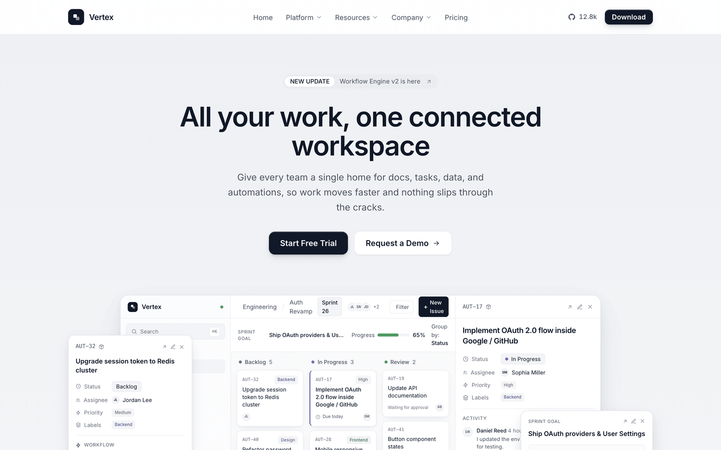
Vertex
SaaS / Startup
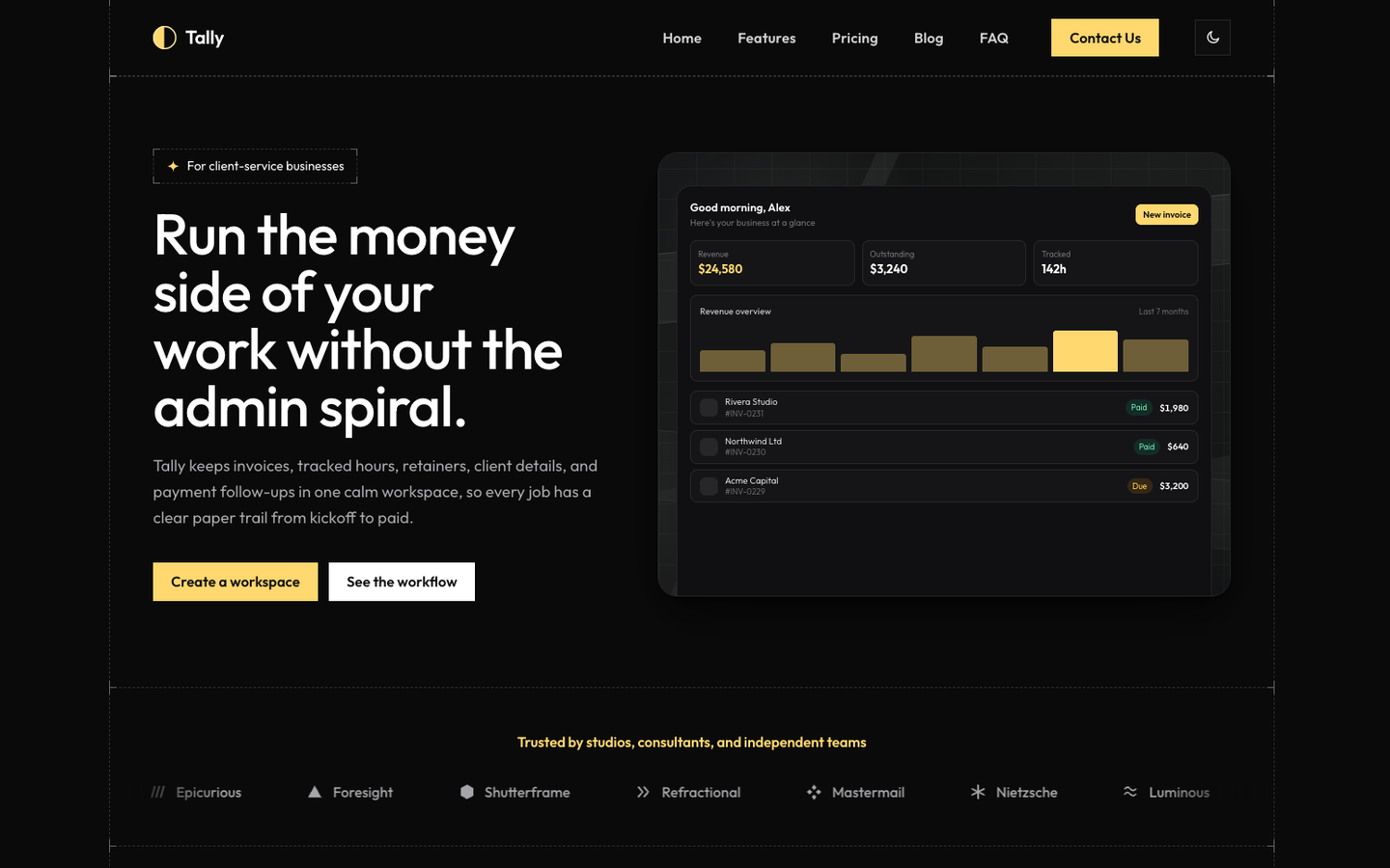
Tally
SaaS / Startup
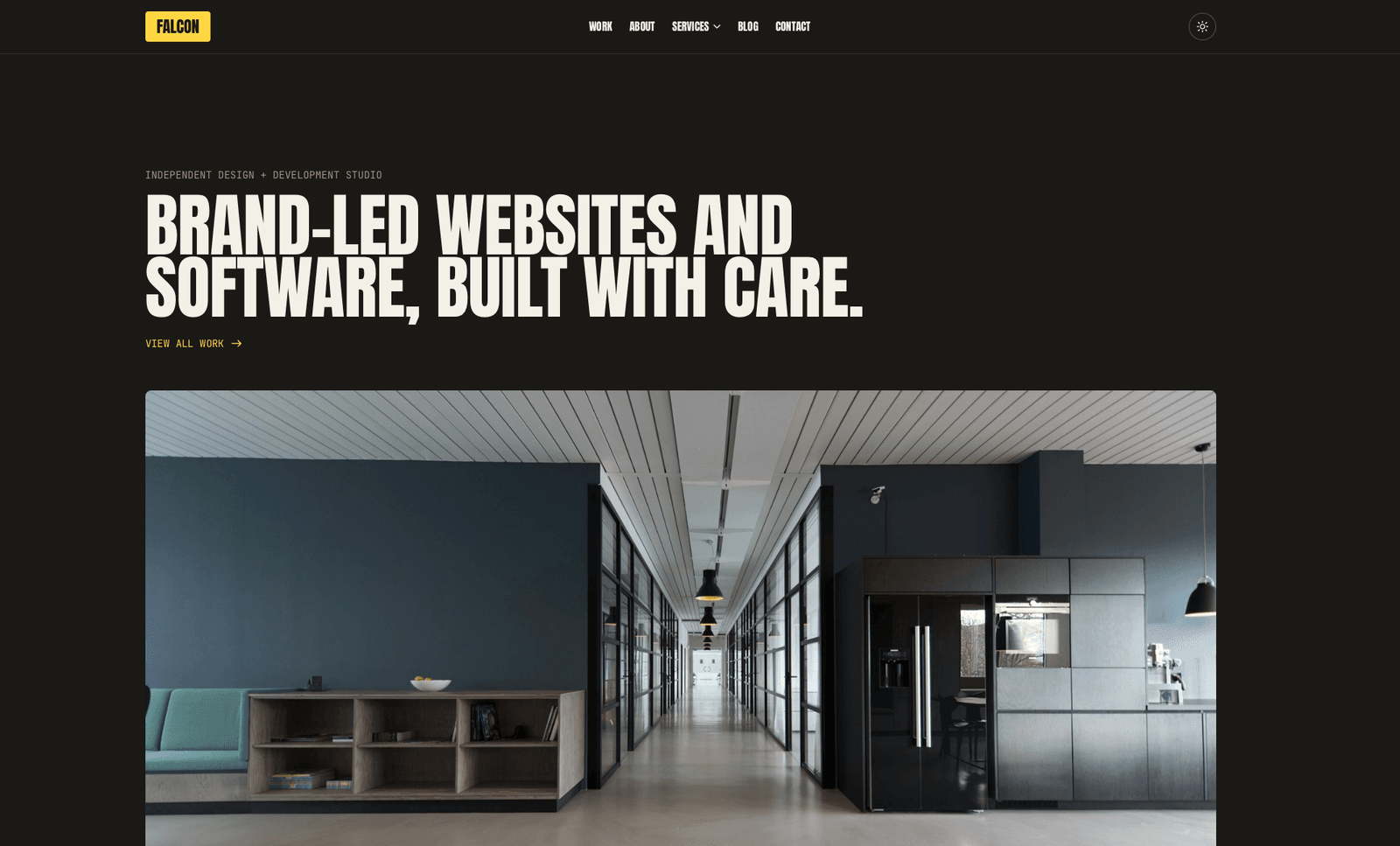
Falcon
Agency / Portfolio / Blog
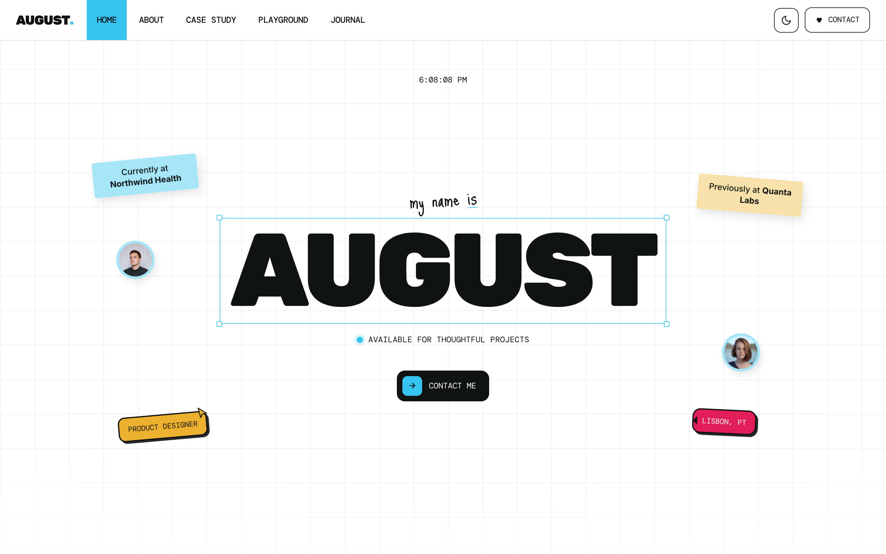
August
Personal / Portfolio / SaaS
Or get every theme - these included - with the All-Access Pass.